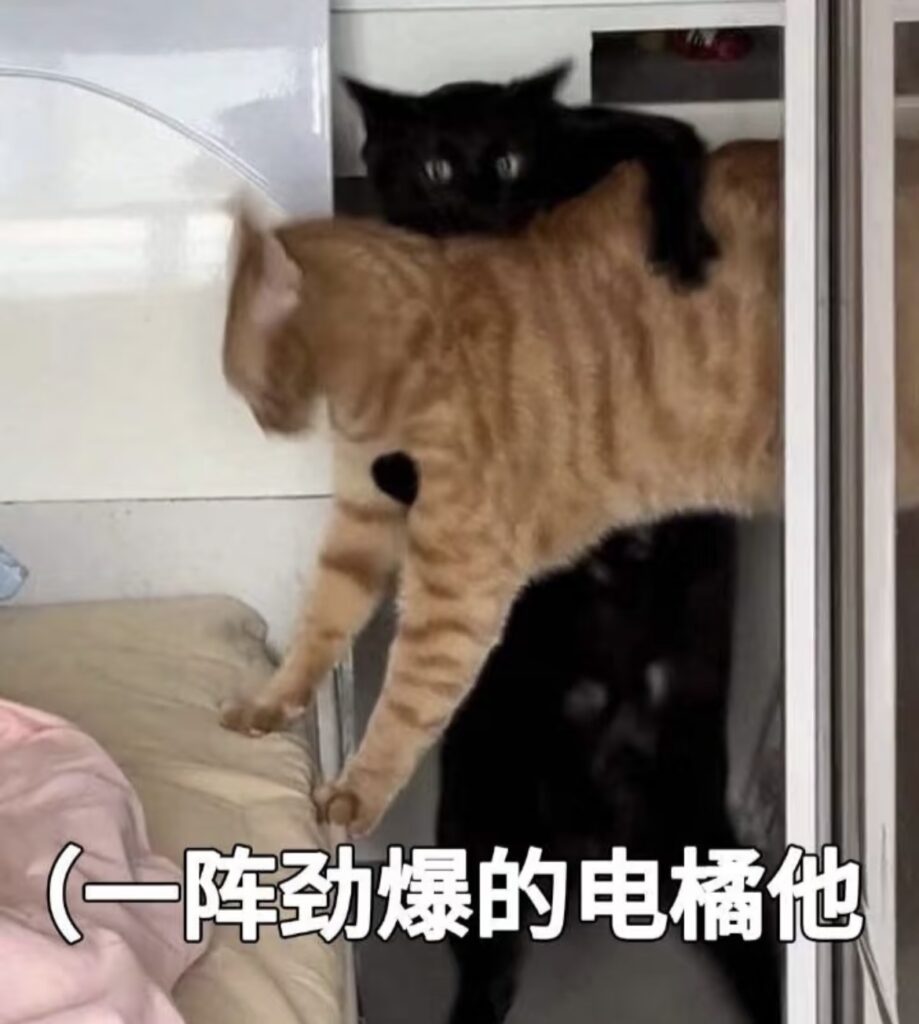
喜欢这个表情哩,但是静态图,怎么够劲爆?!那就给它来点动画~
首先需要先把橘猫抠图抠下来,再准备个炮火和圆环的图片。以表情包原图作为背景图,使用绝对定位将素材进行摆放,记得加上z-index来控制图片的层级。
<div class="bg">
	<img class="ju" src="./images/cat.png"  />
	<img class="huan-1" src="./images/huan.png" />
	<img class="huan-2" src="./images/huan.png" />
	<img class="huan-3" src="./images/huan.png" />
	<img class="fire" src="./images/fire.png" />
</div>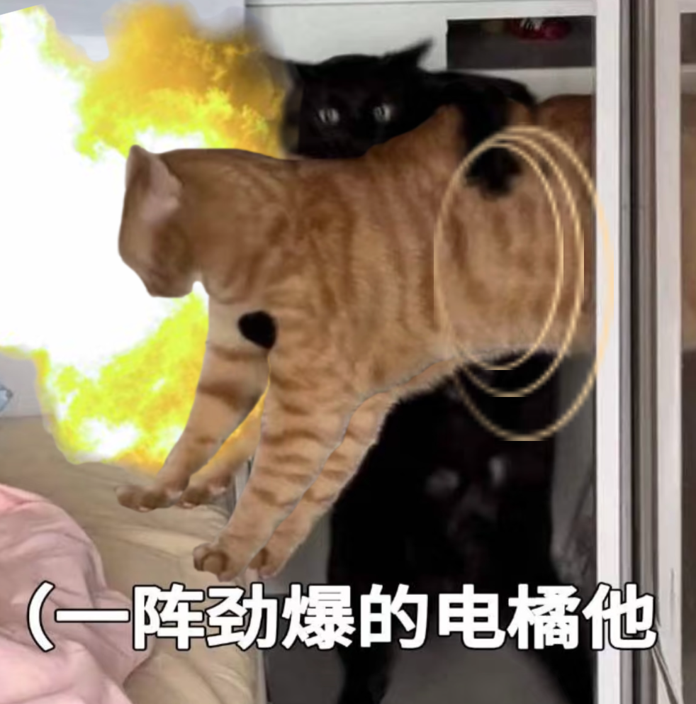
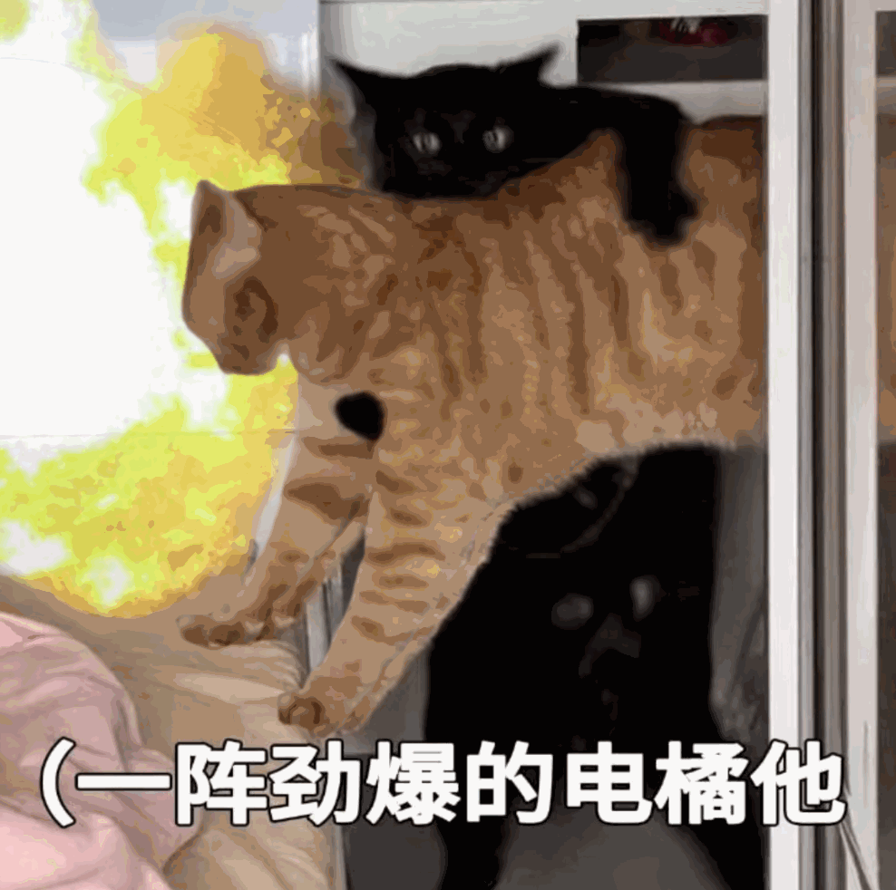
定位好之后,逐一添加动画效果。射击是向左的,所有素材均做向左来回运动。圆环和炮火加上透明度的变化,同时注意各动画的时间设置,让整体动作更流畅些。具体样式及动画如下:
<style>
.bg {
	width: 400px;
	height: 400px;
	position: relative;
	background: url('./images/bg.png');
	background-size: 100% 100%;
}

.bg .ju {
	z-index: 5;
	width: 260px;
	height: 285px;
	position: absolute;
	top: 45px;
	left: 68px;
	opacity: 1;
	animation: JU 0.2s linear infinite;
}

.bg .huan-1 {
	z-index: 10;
	position: absolute;
	top: 80px;
	left: 250px;
	height: 130px;
	animation: Huan1 0.2s linear infinite;
}

.bg .huan-2 {
	z-index: 10;
	position: absolute;
	top: 75px;
	left: 250px;
	height: 150px;
	animation: Huan2 0.4s linear infinite;
}

.bg .huan-3 {
	z-index: 10;
	position: absolute;
	top: 70px;
	left: 250px;
	height: 180px;
	animation: Huan3 0.5s linear infinite;
}

.bg .fire{
	z-index: 1;
	position: absolute;
	top: -0px;
	left: -80px;
	width: 280px;
	transform: rotate(-15deg);
	animation: Fire 0.2s linear infinite;
}

@keyframes JU {
	0% {
	  transform: translateX(0);
	}

	50%{
	  transform: translateX(30px);
	}

	100% {
	  transform: translateX(0);
	}
}

@keyframes Huan1{
	0%{
	  opacity: 0;
	  transform: translateX(0px);
	}
	30%{
	  opacity: 0.3;
	  transform: translateX(-20px);
	}
	60%{
	  opacity: 0.3;
	}
	100%{
	  opacity: 0;
	  transform: translateX(-60px);
	}
}

@keyframes Huan2{
	0%{
	  opacity: 0;
	  transform: translateX(0px);
	}
	30%{
	  opacity: 0.45;
	  transform: translateX(-60px);
	}
	60%{
	  opacity: 0.45;
	}
	100%{
	  opacity: 0;
	  transform: translateX(-160px);
	}
}

@keyframes Huan3{
	0%{
	  opacity: 0;
	  transform: translateX(0px);
	}
	30%{
	  opacity: 0.35;
	  transform: translateX(-140px);
	}
	60%{
	  opacity: 0.35;
	}
	100%{
	  opacity: 0;
	  transform: translateX(-200px);
	}
}

@keyframes Fire{
	0%{
	  opacity: 0.1;
	  transform: translateX(0px);
	}
	30%{
	  opacity: 0.3;
	  transform: translateX(-10px);
	}
	100%{
	  opacity: 1;
	  transform: translateX(-30px);
	}
}
</style>
最终效果,对味了