
上一篇文章已经讲了如何配置深色模式,这篇分享一下Element Plus下的深色模式如何配置,其原理依然是通过给html添加属性,使用定义好的css变量来达到切换的效果。需要注意的是,Element Plus 的暗色主题是通过类名 class=’dark’ 来识别的。
一、配置深色模式
1.安装
npm install element-plus --save
// 或
pnpm install element-plus
2.引入element-plus以及主题文件
// main.ts

import { createApp } from 'vue';
import App from './App.vue';

import ElementPlus from 'element-plus';
import 'element-plus/dist/index.css';
import 'element-plus/theme-chalk/dark/css-vars.css';

const app = createApp(App);

app.use(ElementPlus);
app.mount('#app');
3.自定义css变量
// src/assets/variables.scss
/* 浅色主题 ( 默认主题 ) */
:root {
    --my-background-color: #ffffff;
    --my-text-color: #222222;
}
/* 暗黑主题 */
html.dark {
    --my-background-color: #000000;
    --my-text-color: #f5f5f5d6;
}

body {
    background-color: var(--my-background-color);
}
在main.ts中引入:
// main.ts

import { createApp } from 'vue';
import App from './App.vue';

import ElementPlus from 'element-plus';
import 'element-plus/dist/index.css';
import 'element-plus/theme-chalk/dark/css-vars.css';

import '@/assets/variables.scss';

const app = createApp(App);

app.use(ElementPlus);
app.mount('#app');
4.添加主题切换逻辑
在上篇中提到过刷新页面时假如是深色模式,会有一个白色的闪屏效果,所以这里直接使用优化后的方法来处理,即在 index.html 中,让浏览器还没加载Vue应用之前就执行主题的初始化:
// index.html

<!doctype html>
<html lang="">
    <head>
        <meta charset="UTF-8" />
        <meta name="viewport" content="width=device-width, initial-scale=1.0" />
        <link rel="shortcut icon" type="image/svg+xml" href="favicon.svg" />
        <title>Official Website</title>
        <script>
            // 获取浏览器缓存的主题模式
            const savedTheme = localStorage.getItem('theme');
            // 获取系统的主题模式
            const systemTheme = window.matchMedia('(prefers-color-scheme: dark)').matches ? 'dark' : 'light';
            // 存在缓存的主题则使用缓存的,否则跟随系统主题
            const theme = savedTheme || systemTheme;
            // 默认配置一般都是浅色主题,不需要特意加'light',只需要识别深色主题
            if (theme === 'dark') {
                document.documentElement.classList.add('dark');
            }
        </script>
        <style>
            html.dark {
                background: #141414;
            }
        </style>
    </head>
    <body>
        <div id="app"></div>
        <script type="module" src="/src/main.ts"></script>
    </body>
</html>
页面中添加主题切换逻辑:
<script setup lang="ts">
import * as Icon from '@/assets/images/icon/config.js';
import { ref, onMounted } from 'vue';
const currentTheme = ref('light');
function initTheme() {
const isDark = document.documentElement.classList.contains('dark');
// 获取当前主题
const theme = isDark ? 'dark' : 'light';
currentTheme.value = theme;
}
function toggleTheme() {
const html = document.documentElement;
const isDark = html.classList.contains('dark');
// 切换主题
const newTheme = isDark ? 'light' : 'dark';
html.classList.toggle('dark');
localStorage.setItem('theme', newTheme);
currentTheme.value = newTheme;
}
onMounted(() => {
initTheme();
});
</script>
<template>
<div class="page">
<img :src="currentTheme == 'dark' ? Icon.moon : Icon.sun" alt="" class="icon-theme" :title="currentTheme == 'dark' ? '切换至浅色模式' : '切换至深色模式'" @click="toggleTheme" />
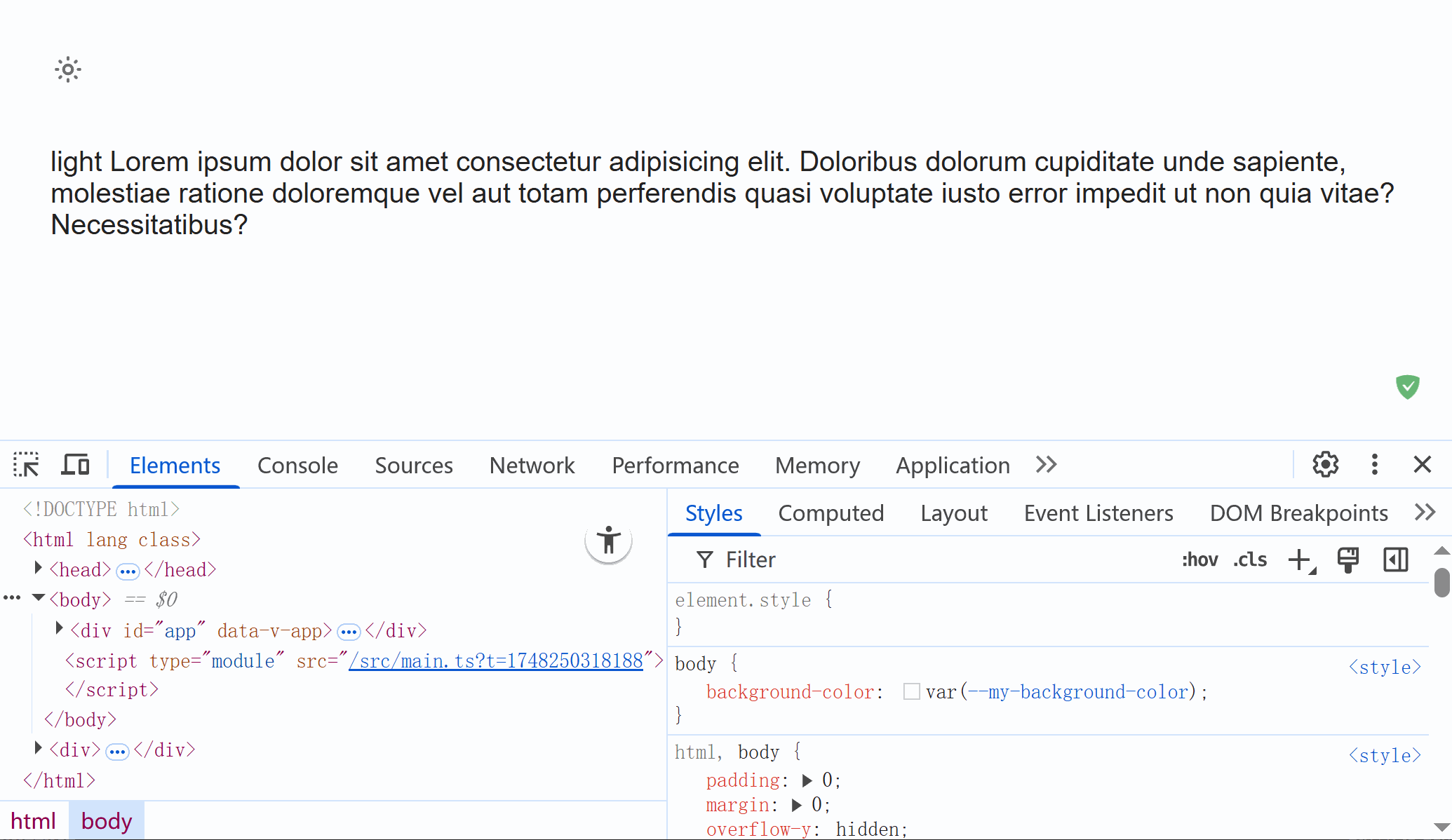
<p>
Lorem ipsum dolor sit amet consectetur adipisicing elit. Doloribus dolorum cupiditate unde sapiente, molestiae ratione doloremque vel aut totam perferendis quasi voluptate iusto error
impedit ut non quia vitae? Necessitatibus?
</p>
</div>
</template>
<style lang="scss" scoped>
.page {
height: 100%;
width: 100%;
padding: 30px;
color: var(--my-text-color);
.icon-theme {
width: 20px;
height: 20px;
margin-bottom: 30px;
cursor: pointer;
}
}
</style>启动项目后即可看到效果:
二、添加切换动画效果
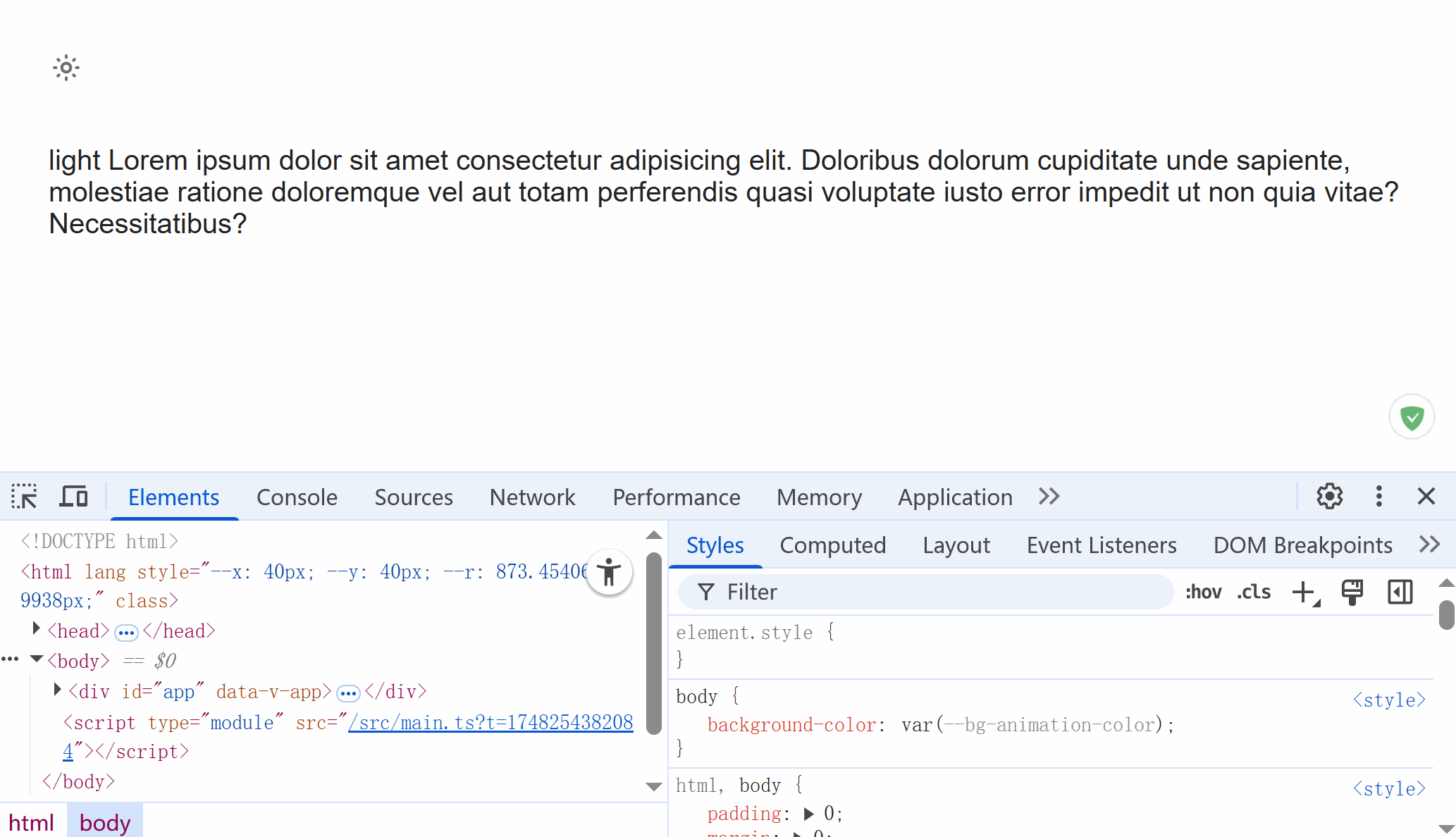
官方切换主题时的动画效果是在右上角圆形逐渐扩散切换的,其原理是利用浏览器的实验特性 view-transition 和CSS 属性 clip-path 实现的,需要注意 View Transition API 在浏览器中的支持情况。
添加动画效果文件(在Art Design Pro项目中抠过来的)并在main.ts中引入:
// src/assets/theme-animate.scss

// 定义基础变量
$bg-animation-color-light: #ffffff;
$bg-animation-color-dark: #141414;
$bg-animation-duration: 0.5s;

html {
    --bg-animation-color: $bg-animation-color-light;

    &.dark {
        --bg-animation-color: $bg-animation-color-dark;
    }

    // View transition styles
    &::view-transition-old(*) {
        animation: none;
    }

    &::view-transition-new(*) {
        animation: clip $bg-animation-duration ease-in;
    }

    &::view-transition-old(root) {
        z-index: 1;
    }

    &::view-transition-new(root) {
        z-index: 9999;
    }

    &.dark {
        &::view-transition-old(*) {
            animation: clip $bg-animation-duration ease-in reverse;
        }

        &::view-transition-new(*) {
            animation: none;
        }

        &::view-transition-old(root) {
            z-index: 9999;
        }

        &::view-transition-new(root) {
            z-index: 1;
        }
    }
}

// 定义动画
@keyframes clip {
    from {
        clip-path: circle(0% at var(--x) var(--y));
    }

    to {
        clip-path: circle(var(--r) at var(--x) var(--y));
    }
}

// body 相关样式
body {
    background-color: var(--bg-animation-color);
}
注释variables.scss中的body样式设置:
// body {
//     background-color: var(--my-background-color);
// }
在切换主题方法中添加动画执行,注意想让View Transition API生效则DOM 更新逻辑需要写在document.startViewTransition方法中,修改test.vue文件中切换主题的方法:
// test.vue
...
function toggleTheme() {
    const html = document.documentElement;
    const isDark = html.classList.contains('dark');
    // 切换主题
    const newTheme = isDark ? 'light' : 'dark';

    // 设置动画起点和半径(左上角扩散)
    const x = 40; // window.innerWidth - 40;(右上角扩散)
    const y = 40;
    const r = Math.hypot(window.innerWidth, window.innerHeight);
    html.style.setProperty('--x', `${x}px`);
    html.style.setProperty('--y', `${y}px`);
    html.style.setProperty('--r', `${r}px`);

    // 判断浏览器是否支持 View Transition API
    if (document.startViewTransition) {
        document.startViewTransition(() => {
            // 自动切换,有dark则删除,无则添加
            html.classList.toggle('dark');
        });
    } else {
        html.classList.toggle('dark');
    }

    localStorage.setItem('theme', newTheme);
    currentTheme.value = newTheme;
}
...
然后就能看到过渡效果啦: